Get your free consultation today!
Share with your Colleagues
Categories
ROI Calculator
Moonstone Interactive is the only San Francisco Bay Area web design firm and Internet Marketing expert that offers a free online ROI Calculator
Author: Global Administrator

With each new year comes a whole slew of new web design ideas and concepts. As a business looking to stay competitive in the online marketplace it is important to be aware of these trends. Here at Moonstone Interactive we analyze all trends and designs and incorporate those into your website to make sure you stay competitive and innovative in online brand image, business results and online search.

Some of the biggest trends for 2015 are:
- Clean pages with big images and organized text
- Content that is direct and to the point
- Clean and clear fonts
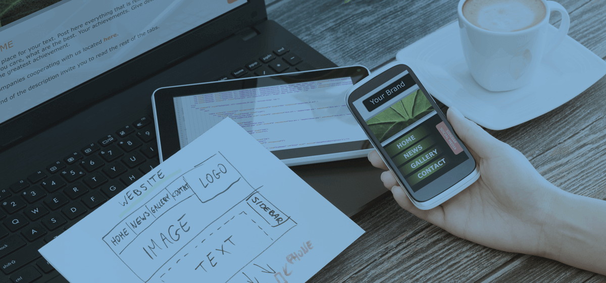
If we had to pick one trend that looks like it is here to stay is the idea of large clean images that are used to break up the text. This trend creates a visually appealing site while still allowing for the use of enough content to please both the user and the search engine. These large images allow space for content but are big enough to break that content up allowing for more content without overwhelming the user with huge blocks of text.
Something to consider when looking at current web design trends is not only user experience but how the search engines will read the page. A lot of design agencies only think about image and user experience (which is very important) but forget to keep the search engines in mind. The way a page is read by the search engines if very important because it doesn’t matter how attractive or appealing your site is if no one can find it in search.
That is one of the reasons we are happy with the idea of large images dominating the web design industry at current. It really allows for more space to put content while breaking it up nicely so the user isn’t instantly turned off upon entering into the site.
What are some trends you’ve noticed popping up this year?


