Get your free consultation today!
Share with your Colleagues
Categories
ROI Calculator
Moonstone Interactive is the only San Francisco Bay Area web design firm and Internet Marketing expert that offers a free online ROI Calculator
Author: Global Administrator

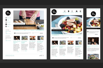
Have you noticed these days websites tend to be a lot more minimalist? At a time when "more Google searches take place on mobile devices than on computers" in the US, your website has to be designed with the mobile experience in mind. That's why you also may have noticed that logos have become more streamlined, becoming less intricate. A flat logo is more likely to look great on both a laptop and a mobile screen. Similarly, an overly fussy web design may not translate on all devices. So designers and businesses are focusing on mobile-friendly web design. Here at Moonstone Interactive we will create a design based around your business needs that will also look great across all platforms.
Internet oracle Google has acknowledged three ways to design for mobile devices: responsive design, dynamic, and separate URLs. But responsive design is the way to go if you want SEO without compromising UX.
Web designers and their clients have already figured that out. The reign of smartphones and their little touch screens has seen a rise in the number of businesses investing in responsive web design, like sites that automatically detect a smaller screen resolution and resize the content accordingly. Other than these little details, the content of the website is essentially the same. But the benefit of mobile-friendly design is that visitors won't get frustrated with having to repeatedly pinch and pull the screen, squinting at a site whose design is antiquated. Chances are those potential customers won’t visit your site again, but they will seek what they need from your competitor’s more user-friendly, responsive mobile website.
Some companies opt for the third Google-approved design strategy, separate URLs, but there are some significant limitations to this choice. Using a separate URL for mobile means customers on their cell phones will be redirected to a whole new website, not the one they are presumably familiar with, the one bookmarked on the desktop at home. Again, a visitor who can't easily find what he or she is looking for (not to mention all that screen pinching) is probably not going to linger on your site for very long.
Creating two different URLs for desktop and mobile also creates an issue for SEO. Of all three options, separate URLs is the least amenable to it, as the rankings of the two URLs remain independent. In other words, the mobile site ranks for itself. A responsive web re-design won't encounter those problems. The UX and the SEO only compliment and amplify each other when you have one URL and a responsive mobile site.
If you are looking to make your website responsive Moonstone Interactive is more than happy to give you a breakdown of what will be necessary and give you all available options.


